Visual Changes in the 2nd & 3rd Edition
The Second and Third Editions of Carcassonne share a similar visual style. These editions represent different milestones since the visual restyling of the game 14 years after its release. This new graphic style has also varied through the years, as you can see below.
Darker cities
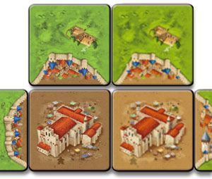
The Second Edition of Carcassonne (or C2 for short) has undergone a few changes in style since its release in 2014. These minor graphic changes do not affect the playability of the game but the visual appearance of the board when combining tiles from different editions or styles.
The first printed versions of the Second Edition of Carcassonne (2014-2016) featured a darker brown colour to the base for the cities. This was also used for the first two major expansions (![]() Exp. 1 - Inns & Cathedrals, and
Exp. 1 - Inns & Cathedrals, and ![]() Exp. 2 - Traders & Builders) as well as some of the promotional items available at that time. [According to several posts on Carcassonne Central Forum] KJW requested that this be lightened, and since then all new releases (from
Exp. 2 - Traders & Builders) as well as some of the promotional items available at that time. [According to several posts on Carcassonne Central Forum] KJW requested that this be lightened, and since then all new releases (from ![]() Exp. 3 - The Princess & the Dragon onwards), and subsequent re-printing of the base game and the first two expansions, have featured the lighter coloured cities.
Exp. 3 - The Princess & the Dragon onwards), and subsequent re-printing of the base game and the first two expansions, have featured the lighter coloured cities.
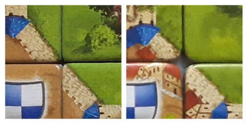
In the example on the right, the two different printings are shown for one of the Cathedral tiles and a couple of adjacent tiles. (Image combined from different versions of PDF of rules for Inns and Cathedrals)
Within the fan community, the darker city version is referred to as Carc 2.0 (C2.0 for short), the lighter city version as Carc 2.1 (C2.1 for short).
Throughout its production history there have been some issues of colour consistency between different expansions and it is something that, as players, we have to try to live with. A few may have aesthetic issues with combining expansions from the two different printings, but the tiles are topologically identical.
Items known to have been produced with darker cities
 Base Game
 River (included with Base Game)
 Inns & Cathedrals
 Traders & Builders
 Essen Spiel Promo Tiles (2014-2017)
 CutCassonne
 Carcassonne_Demo-Spiel
Cities with clipped buildings
Since 2020, the new releases kicked-off the Third Edition of Carcassonne (or C3 for short) with a few exceptions. This new edition changed its graphic style, affecting cities most noticeably:
- The artwork style tends to show more detailed graphics and textured buildings.
- Cities feature some buildings overflowing the tile and therefore clipped at the tile edges. This causes a discontinuity at the city edges, since the illustration is interrupted abruptly.
- Cities include some distinctive features: buildings with black roofs, squares with a well and a new type of water towers.
- Monasteries show no crosses on top of their belfries.
Previously, the Second Edition artwork style featured buildings distributed more sparsely in cities. They would be near the edge of the tile but never overflowing it.
Items known to have been produced with this new style:
 The Peasant Revolts
 20th Anniversary Edition (it follows the C3 style, although it is considered a separate edition)
 The Gifts (cards showing cities in the new style)
 The Signposts
 The Festival C3
 Castles in Germany C3
 Ghosts, Castles & Cemeteries
 The Bets
 The Wonders of Humanity
 The Spell Circles
 The Drawbridges
Rounder corners
Some of the latest print runs of C2 and some of the C3 print runs feature tiles with rounder corners. It hasn't been reported the reason for this, and there is no consistency for the time being. The place of printing seems an indicator, however this is also not always consistent for a publisher.
Most of the latest C2 releases have fairly square corners, and most C3 releases have more rounded corners (e.g. all the mini expansions released by HiG), but, for example, the C2 base game (second printing) by ZMG from 2019 has tiles with rounded corners, and C3 ![]() Big Box 7 by ZMG or Mindok released later (2021-2022) with squarer corners.
Big Box 7 by ZMG or Mindok released later (2021-2022) with squarer corners.
Some items released with rounder corners:


